
Type Displayed
Part One: Type Specimen Posters
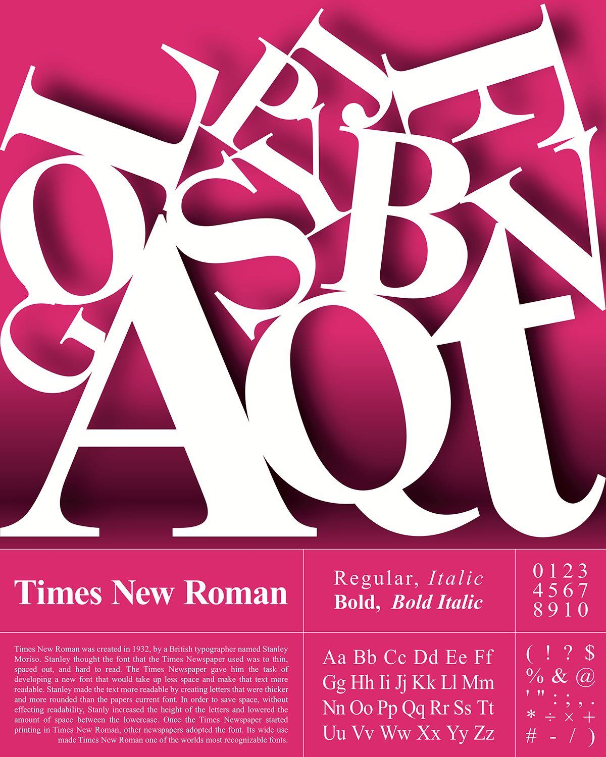
This project was to create type specimen posters that showed off the two fonts that we selected. We were expected to include all of the typefaces of the font, the numbers, the important symbols, and all the letters.
My concept for these posters was to show off the specific characters and their unique qualities. I wanted to display the letters in a different way than they are usually shown. When I got this assignment, I thought of the way letters would be displayed in a museum. I liked the falling letters concept because it gave the posters an interesting look that draws the eye. It was challenging to place the letters in an astatically pleasing way, that looked realistic, and didn’t cover up their forms. In the end I think that this series of posters fits together nicely and has enough variation for each to stand alone.


Part Two: Create a Typeface
This project was our intro to glyphs. We were expected to create a typeface that combined elements of the two fonts that we included in our type specimen posters.
My concept for this project was to keep the readability of Helvetica and combine it with the stylistic elements of Times New Roman. Each character was created from the pieces of the matching characters in the other fonts. I used the serif style of Times New Roman, and the consistent stroke width of Helvetica to piece together each letter and number. The second part of this assignment was to create a type specimen poster.

Making a typeface is not something that I had done before, and it was harder than I thought. Having to create the letters out of other fonts made it difficult to match the stroke width and create a consistent style.


